There are so many different ways you can design your charity website. From emotional and professional to exciting and informative, you have to decide which design style is right for you. To help make the options feel less overwhelming, I’ve created a list of 10 charity websites you can draw inspiration from. Check out the list below!
Charity Website Ideas to Spark Inspiration
Whether you already created your organization or you’re still reviewing nonprofit ideas, you’ll need a website. Let’s get into the 10 charity website ideas to spark inspiration for your own organizations.
1. Alex’s Lemonade Stand Foundation for Childhood Cancer
Our first example shows us how charities can have bold and bright websites!
Alex’s Lemonade Stand Foundation for Childhood Cancer raises money for childhood cancer research. They also provide monetary support for childhood cancer patients and their families. They’re the largest independent childhood cancer charity in the country!
The homepage has a rotating carousel that showcases their mission and upcoming events. Scroll further down the homepage and you’ll see a special section where they feature a specific child who is currently battling cancer.
This charity website also transparently discusses how much money they’ve raised over the years. It’s visible right on their homepage at more than $300 million.
What I find interesting about their website is the section that showcases donor funds. There’s a fundraising section on the homepage that lists recent donations and the organizations who donated them. It’s a great way to recognize their donors. It also provides subtle social pressure for other donor partners to contribute.
If you’re looking for colorful design inspiration for your charity website, Alex’s Lemonade stand is a professional yet fun example!
2. Digitunity
When you visit a charity website, you’re looking for transparency around its mission, donation options, and successful projects. Digitunity shows us a direct example of how to effectively address these needs.
Digitunity puts a spotlight on the digital divide in different families across America. If a child doesn’t have access to a computer in today’s society, they will have a much harder time achieving success. This nonprofit organization focuses on making it possible for everyone in the community to own a computer.
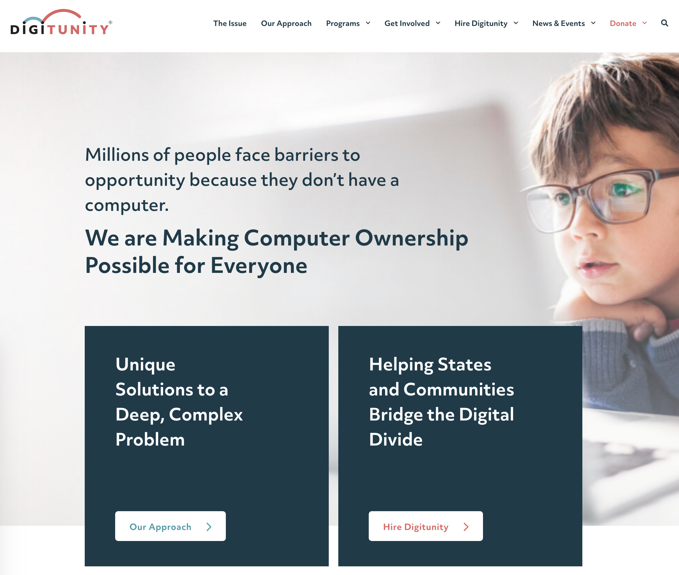
As an organization that focuses on digital accessibility, their website needs to properly raise awareness for the issue. Digitunity worked with an agency to create their website, and this strategic commitment shows in the end result.
Donors find it easy to find the donation portal on Digitunity’s website. There’s a red “donate” tab in the dropdown menu, and there’s donation boxes throughout the site.
The rest of the site’s content is clearly organized so visitors can:
- Contact the organization
- Donate both money and computers
- Read about current events the company is involved in
I’ve found that partnering with an agency or an industry professional can help your branding and website stand out from all the others.
For nonprofits who are focused on technology and accessibility, consider forming a partnership with a creative agency to design your website! However, if you can’t afford to hire an agency, artificial intelligence design tools could be a helpful alternative.
3. Registered Charity Ideas: Double Up Food Bucks Michigan
Double Up Food Bucks Michigan shows us how to seamlessly incorporate video content into your website’s design!
Double Up Food Bucks Michigan helps make healthy fruits and vegetables more accessible for Michiganders. This charity matches EBT/bridge card payments spent on fruits and vegetables at up to $20 per day.
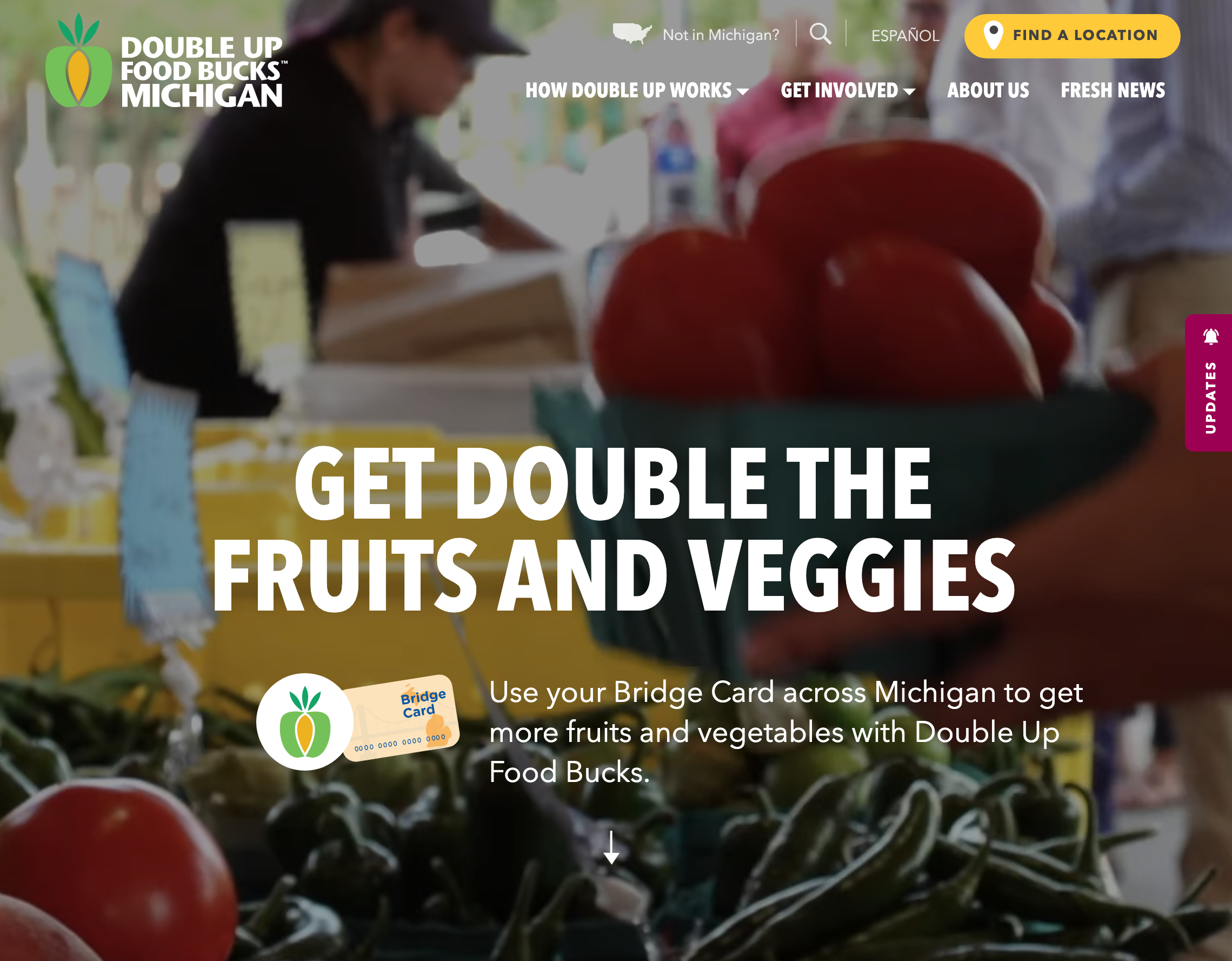
The dynamic video on the homepage motivates visitors to linger for longer than they normally would. It’s also perfectly paired with concise copy. The slogan on the homepage is bold and short. This means visitors understand what the organization offers while simultaneously being entertained by the video content.
The navigation bar is concise. The options are clear for donating money, receiving funding, and reading a helpful article or two. It’s clear how supporters can get involved, whether through service or donations.
There’s also a helpful sidebar that pops out when you land on the homepage. It provides important updates and direct links to the top pages.
This charity is also location-based, which makes its location pages that much more important. The website addresses this need with a bright yellow “find a location” button.
As with most donations to nonprofits and charities, the money you donate is tax deductible! Which charitable contributions are tax deductible? A tax professional can help you determine this.
When looking for inspiration on how to expertly combine text and video content, look to Double Up Food Bucks Michigan!
4. Crisis Text Line
When your mission is as important as Crisis Text Line’s, you need to have an effectively designed website.
Crisis Text Line provides free and confidential support 24/7 to those in crisis via a volunteer crisis counselor.
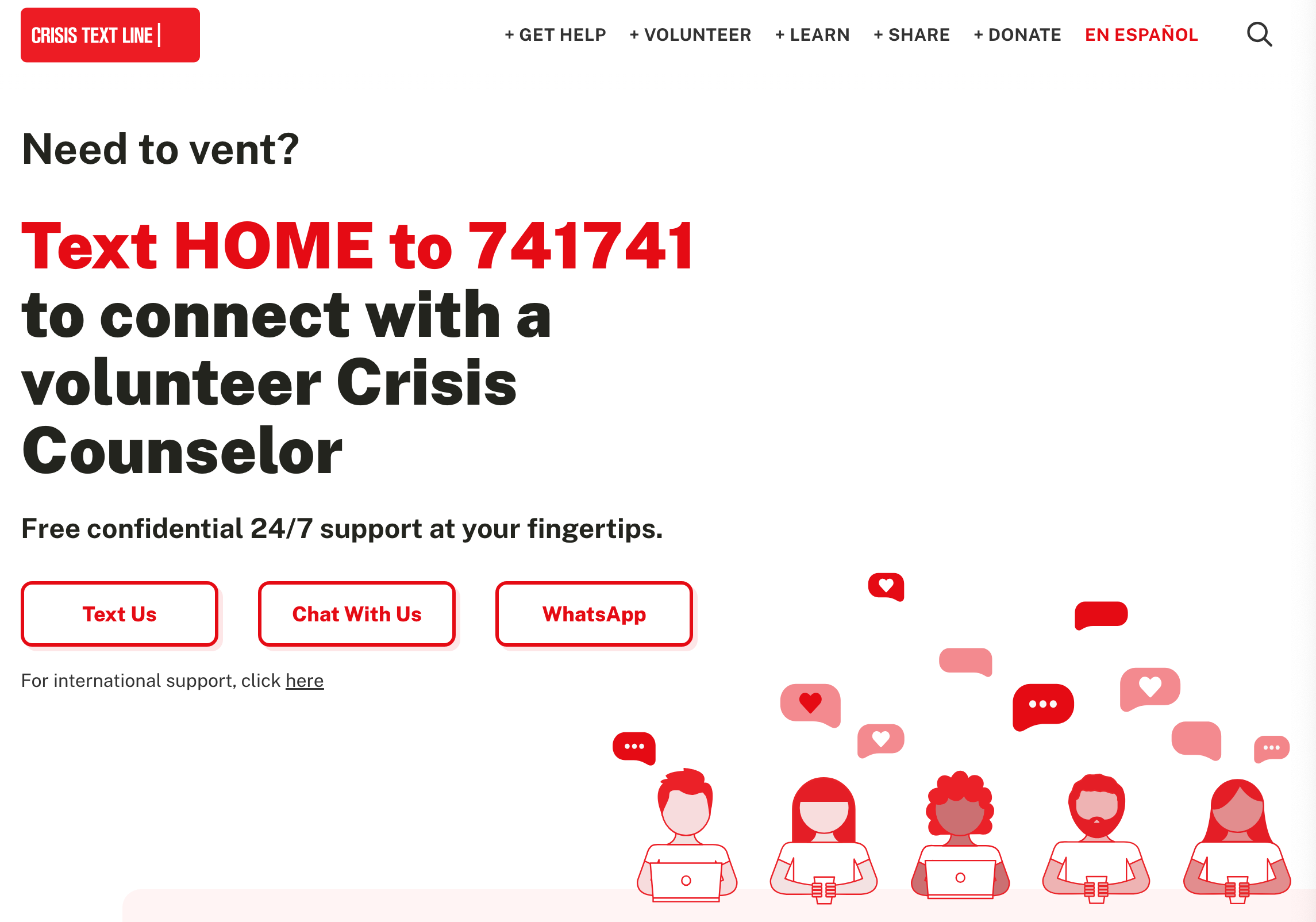
The text on the homepage is large, bold, and easy to read. The most important messaging colorfully stands out, with the texting information written loud and clear.
Red is a bold and eye-catching color that emotes feelings of courage, power, and passion. Understanding the psychology of color in logo design can help you choose the most impactful colors for your site.
The rest of the homepage explains how the crisis text line works and the many mental health issues they can help with. For those in crisis and looking for answers, this charity website is ready to address them.
After listing all the ways they can provide immediate support to those in crisis, they focus on donations further down the page. Toward the bottom of the homepage, there are clear options to donate to their cause, share the crisis phone number, and become a volunteer.
When creating a charity website for organizations that assist in matters of life and death, Crisis Text Line is a great reference.
5. Accept Donations Directly on the Site: The Memphis Zoo
How do you design a fun charity website? The Memphis Zoo shows us how!
The Memphis Zoo is a nonprofit organization in Tennessee. This zoo features a wide variety of animals sure to impress all who visit, including elephants, tigers, gorillas, and so many more species.
This charity website is all about the animals. There’s options to explore each of the exhibits, adopt an animal with your donations, and even watch live animal webcams.
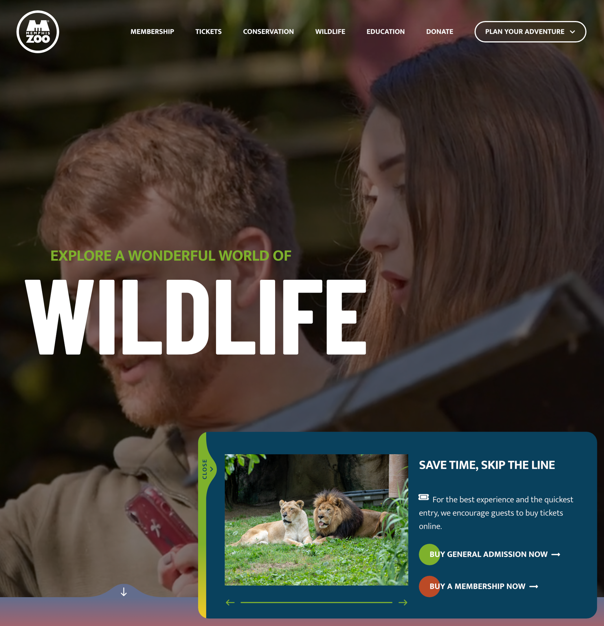
While the website is focused on the animals and the zoo’s mission, it’s also about the customer experience. Before members of the community even step foot in the zoo, they can start planning a seamless experience for themselves.
The zoo’s website allows people to:
- Book tickets
- Buy memberships
- Review zoo maps
- Browse food options
- Read through frequently asked questions
- Check out adventure guides
Additionally, even if you don’t live anywhere near Tennessee, the site’s design still provides donation options directly online.
When the in-person experience is the star of the show, your charity’s website still matters! The Memphis Zoo shows us how to bring your dynamic digital vision to life.
6. BosMUN
Top charities know that their websites don’t have to be boring!
BosMUN also understands this, and their creative spirit is reflected in this organization’s site.
BosMUN stands for the Boston University Model United Nations. It’s a simulation of the United Nations that Boston University hosts annually for high school students.
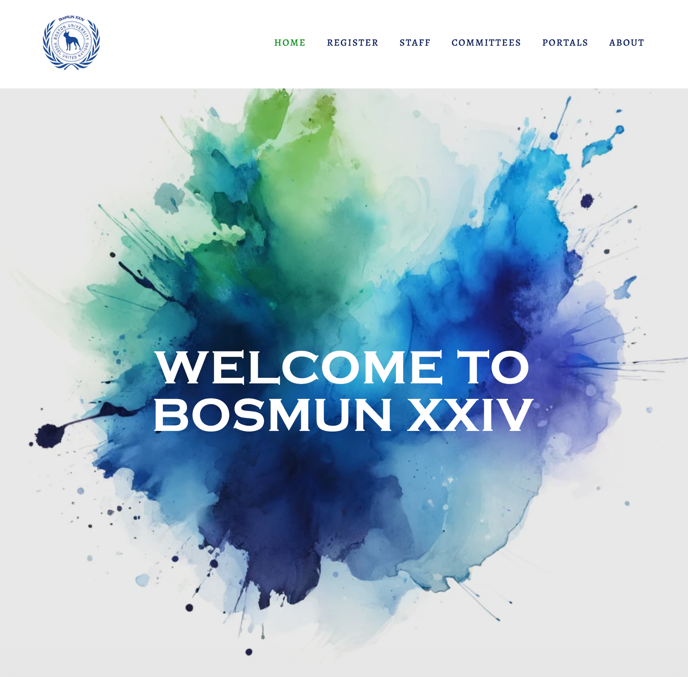
This program is an exciting one for students, and BosMUN’s eye-catching website reflects this excitement. The students themselves are featured on the site’s homepage. A letter from the secretary-general takes up the majority of the page, with a professional headshot to personalize the text.
The navigation bar shows visitors how they can register for the event, apply for staff positions, and join committees. It’s easy to understand for both students and their parents.
If your charity website needs to cater to an audience with a wide age range, look to BosMUN for inspiration!
7. The Working Cat Project
The Working Cat Project proves that anything is possible, even when designing your website with Squarespace!
The mission of The Working Cat Project is to take feral cats that aren’t suitable for indoor living and giving them a second chance in other environments, like safe barns.
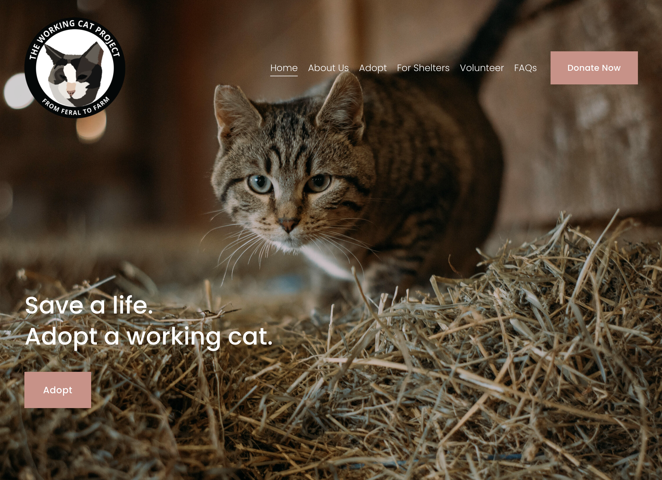
When you land on the site, their goal is made clear with succinct text and a full-page picture. Scrolling down below the fold, there are several paragraphs that provide more details about the work they do.
While this section might appear text-heavy, it clearly explains the requirements for working with them and the unique ways they’re making a difference. When you have programs that are complex, you can dedicate large sections of text to it without it being boring.
Now that site visitors understand the important work they’re doing, it’s time to feature what people really want to see: the cats! The charity website has an entire section on their homepage that showcases the cats they’ve placed in barns and farms. The pictures are large and high-quality, with short captions underneath to tell each cat’s story.
This site does a great job of explaining their important work and connecting with donors through emotional stories. When looking to support animals through your nonprofit organization, take inspiration from The Working Cat Project’s website!
8. InHerShoes
If you’re designing a charity website that specifically helps women, turn to InHerShoes for inspiration.
This organization’s mission is to encourage girls to be 1{d0d8c9a3780aae347a3c0ec9b539f6350131b27bfcedb699d8911923448b0bae} more courageous. Ultimately, lifting up women and giving them confidence benefits communities overall.

The homepage perfectly combines bright blocks of color and beautiful photography. The copy is short and straightforward, which makes it easy for visitors to understand their mission.
The remainder of their site follows the same eye-catching design style. Each of their three programs underneath their mission are easy to understand. By keeping the copy light, the purpose is clear.
People are skimming more than reading these days, which is something to keep in mind when writing content for your own nonprofit website.
With a video below the fold, you can easily and quickly get an idea of what their mission is. The prompt to subscribe to their newsletter is big and obvious. The nonprofit site also clearly displays the long list of organizations they partner with.
When looking to quickly build credibility with your audience, InHerShoes is a great source of website design inspiration!
9. Top Charities: To Write Love On Her Arms
When looking for design inspiration from top charities, To Write Love On Her Arms is one to consider!
To Write Love On Her Arms aims to help people who are facing depression, addiction, self-injury, and suicide find hope in these difficult situations. This charity is a direct investor of various treatment and recovery options for these individuals.
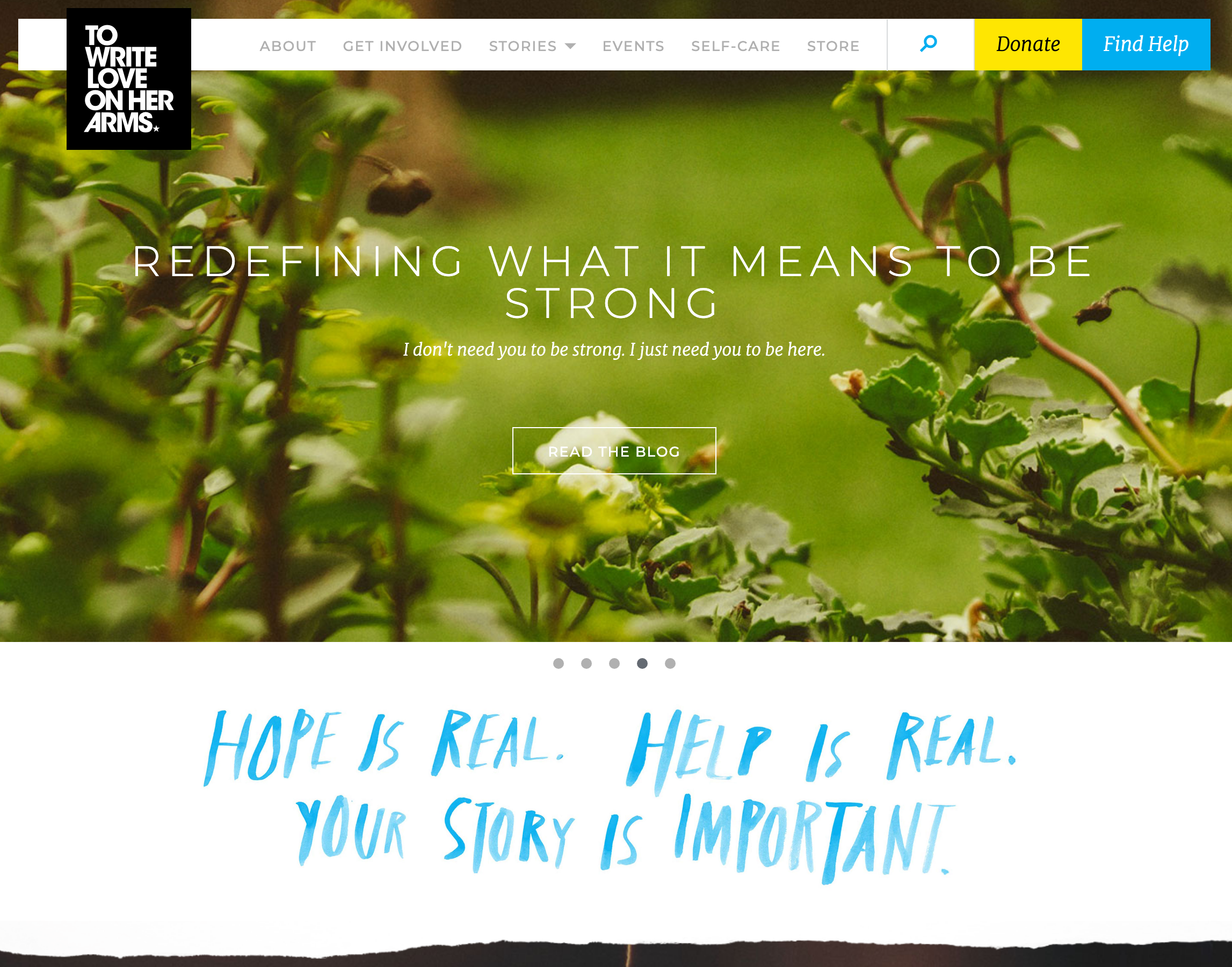
The main feature of the homepage is a carousel. It rotates to feature upcoming events, the latest article, mental health tools, and more. After discussing the many ways they help various communities, the site goes on to feature the TWLOHA store and blog.
The main color on their site is a calming blue, and it’s highlighted throughout. The “donate” button is easy to find in the navigation bar in bright yellow.
When looking to create a charity website that’s sensitive to difficult emotional issues, To Write Love On Her Arms shows us a way we can achieve this.
10. Human Rights Watch
When discussing human rights abuses, your charity website needs to appropriately address the sensitive nature of these topics.
Human Rights Watch is one of the top charities for investigating and reporting on human rights abuses around the world.
With so many articles to choose from, their website makes it a seamless experience by sorting each article by country and topic. The layout lends itself to more of an online newspaper feel, which further helps their credibility.
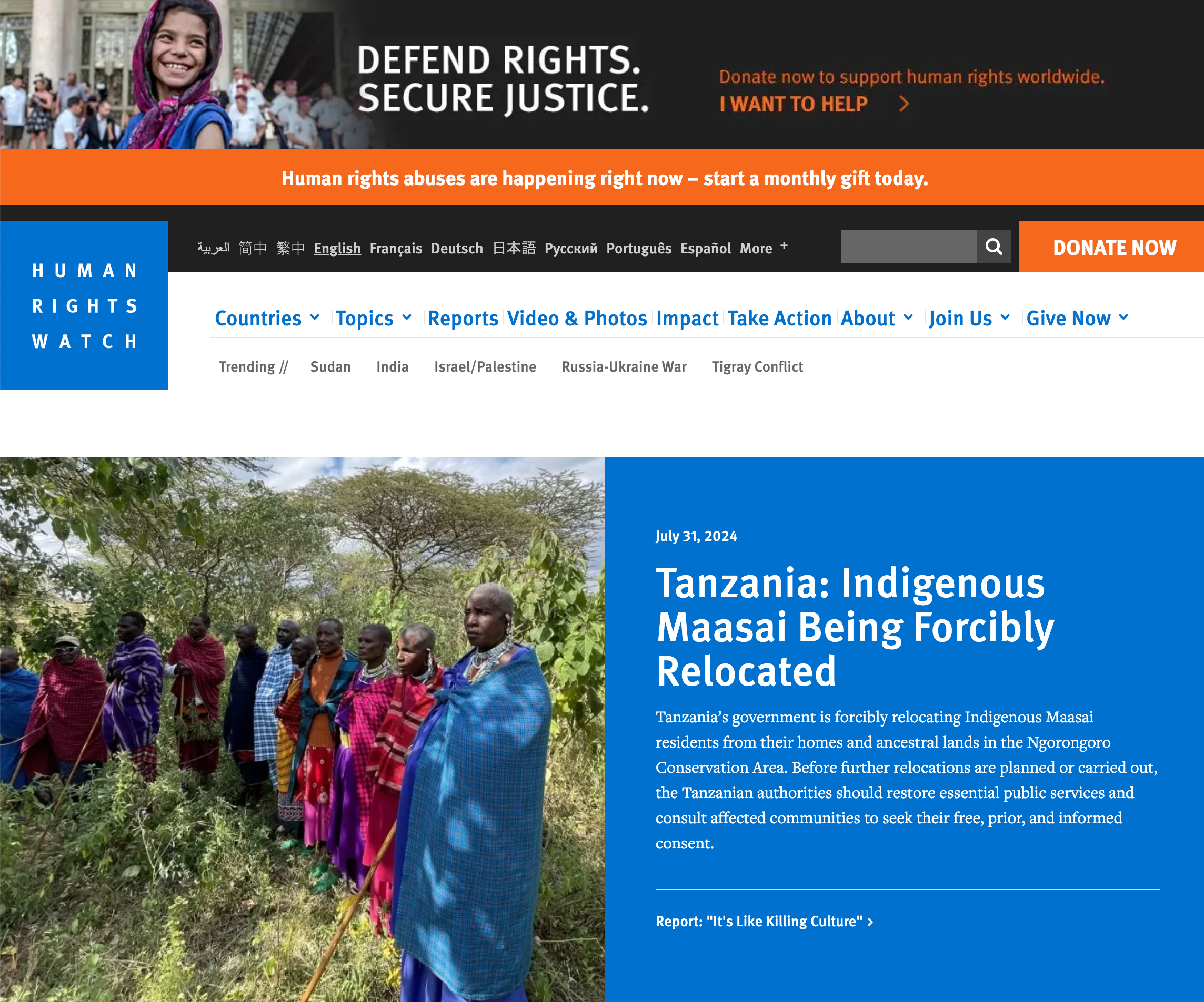
Focusing on specific keywords under the human rights category, this charity website shows how nonprofits can use SEO to their advantage. Understanding SEO for nonprofits is so important for the success of the website and Human Rights Watch knows what they’re doing.
Find Design Inspiration for Your Charity Website
No matter what your nonprofit’s mission is, we hope these charity website examples helped you find design inspiration!


