Are you wondering what type of wedding website you should have for your big day? If so, this list of stunning wedding website examples will give you inspiration!
Checking example wedding websites gives you a good idea of what information you should include in your own, alongside ideas for colors, fonts, imagery, and unique visual style.
Plus, a wedding website lets guests know what to expect while getting everyone excited for the upcoming nuptials.
Whether you’re having a black tie formal affair, or a vintage-inspired dreamy event in the country, let’s take a look at some of the best wedding website examples to inspire your own.
Ready to build your website?
Check out these best wedding website builders.
Best Wedding Website Examples
Now, we’ll look at a few of the best wedding website examples I could find that look beautiful, have personal touches and easy to find information.
1. Rush and Danit
The Rush and Danit wedding website has a unique and fun design idea for couples who met when they were kids.
Instead of using the usual adult couples shot on the homepage, they create a little nostalgia, with pictures of both of them as children.
They offer a simple message – ”We’re Getting Married” and an ”Enter” button takes you through to the next page where you can find all essential information such as:
- Wedding venue and date
- How to RSVP
- What gifts to bring
- Agenda for the day
- Information about how they met
- Accomodation options for guests
They even have a few quirky extras like asking guests to fill out a form for what song they want to hear at the wedding and some details about their cute dog Olive.
With all important information clearly set out for guests and a fun and quirky style, this wedding website has it all.
2. Chloe & Jack

The Chloe and Jack wedding website looks professionally designed and has a unique vintage style.
The homepage clearly states the date of the wedding and showcases the message ”Inviting You to Join Us to Tie the Knot”.
As you scroll further down, you get information about where the reception and ceremony will be held, and a black and white photo of the couple further supports the retro theme.
I like that you could find navigational links for the registry and wedding details are found at the top and the footer, so you can easily click through wherever you are on the page.
The ”Details” page clearly gives all the information guests need, such as dress code, plus-1, photography, the ceremony, bar, and closing time.
And, an image of their pet dog in the footer gives this site a personal touch you can’t help but love.
3. Our Dumb Wedding Site

The Our Dumb Wedding Site stands out from the usual elegant style and brings a little personality to this list!
While it doesn’t have the usual sophisticated curved fonts and pro wedding photos, it has many personal touches like the homepage statement where Ben and Casey describe disagreeing about the website copy!
In the wedding location description, it states: ”April 29th 2017 France… LOL jk, it’s in Baltimore!”
Jokes aside, the rest of the website is easy to navigate, with an expandable right hand side pane and the ceremony, reception, and afterparty times and locations further down the page.
4. Alex and Andrew
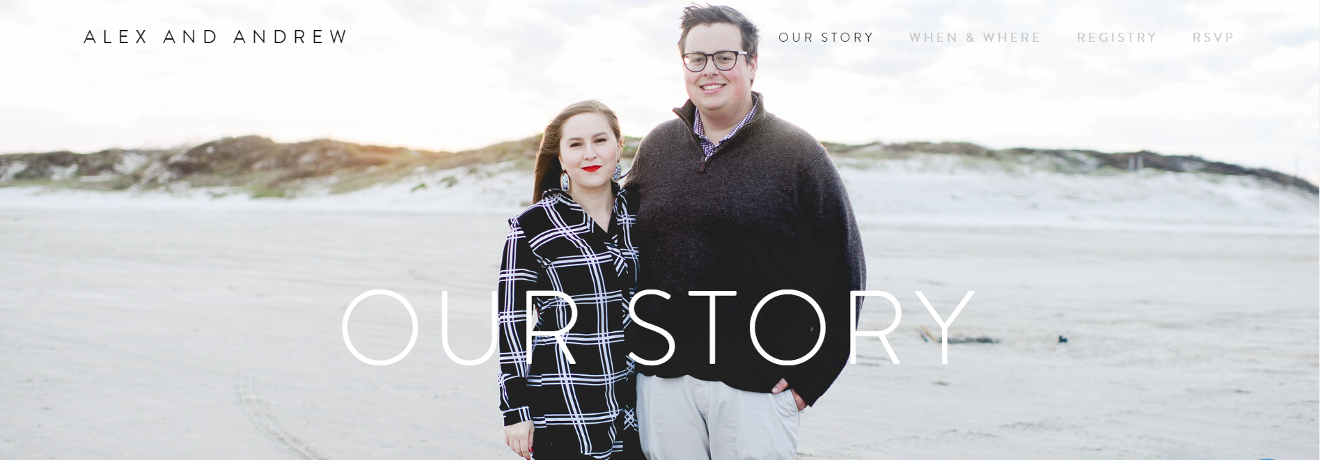
The Alex and Andrew wedding website offers a clean and minimalistic style with tons of personal touches.
The homepage features the story of how they met, how he proposed, and tons of cute photos of their time together so far.
All wedding information can be found in a single top-right-hand navigational bar featuring:
- Our story
- When and where
- Registry links
- RSVP
While each page has minimal text, there is enough information so guests know where to go and what to wear at what time, and tons of great couple imagery get you in the wedding mood!
5. Alex & Bailey

The Alex and Bailey site is one of the best wedding website examples that uses a ton of beautiful visuals and great storytelling.
The homepage features a photo of the proposal, a timeline with imagery of the milestones in their relationship, more happy couple photos, and information about the wedding party.
The header navigational bar has links to multiple pages for information about the big day such as:
- Travel
- Our story
- The details
- Wedding party
- Travel guide
- FAQs
- Gift registry
With a classic and fresh feel, this wedding site feels really professional and has tons of personal touches which make it their own.
6. Andrew and Amanda
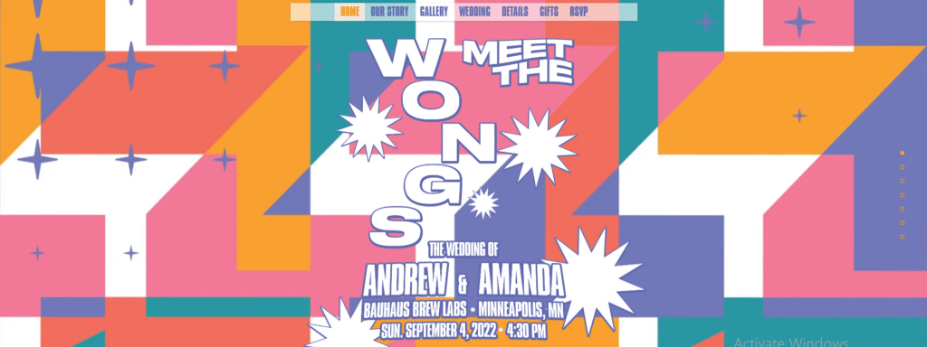
The Andrew and Amanda wedding website is a refreshing shock to the senses with its groovy style and colorful aesthetics.
Upon entering the site, you are presented with a pink, yellow, and turquoise retro-style homepage and the text: ”Meet the Wongs”.
As you scroll down, you can see the date and location of the wedding, a description of their story, and tons more information for guests such as attire, accommodation, and wedding schedule.
I love the animated stars on this site that really pop out at you, and the static header bar and multiple buttons down the page give guests easy access to information wherever they are on the page.
7. Calyani & Matthew

The Calyani and Matthew site is one of the best wedding websites examples for those who want a dreamy, romantic style.
As you enter the homepage, you’re presented with the couple walking in wedding attire across the beach.
Further down, the site is sectioned with pine green and cream rustic tones and tons more photos of the couple’s adventures together so far.
The sticky sidebar stood out to me on this elegant wedding website, allowing guests to click through to pages quickly whenever they felt like it.
8. Charlotte & Will

The Charlotte and Will site is another beautiful wedding website example with elegant style and stunning imagery.
Every inch of the site seems to be crafted to perfection, with the homepage showing a beautiful floral logo, the wedding date, and a countdown clock to the big day.
The right-hand side navigational bar is available as you scroll down the page for easy access to all other wedding information, such as; details, our story, wedding party, registry, and a gallery.
Even the couple wear color-matched outfits in their engagement photos on the homepage, really showing how much thought they have put into the site!
9. Jared and Hallee
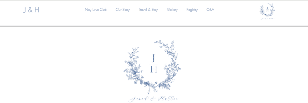
The Jared and Hallee site is a simple wedding website that exudes elegance and wholesome charm.
As you land on the homepage you’re presented with a pretty floral logo and further down the page you can learn how they met as high school sweethearts.
The web design incorporates a blue/grey and white color palette for a simple and elegant style, perfect for a wedding website.
And, alongside the usual important details and beautiful photos, I really liked how they included thoughtful elements such as a ”Shuttle Bus RSVP” button where guests can register for a lift to the event.
10. Sabrina Joy & Matt
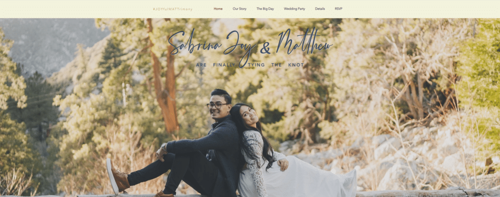
The Sabrina Joy and Matt site uses a mix of beautiful pictures and bold blocks to create a unique wedding website.
They have taken advantage of the logo space by adding in their hashtag #JOYfulMATTrimony to remind guests to tag them in their photo uploads.
Plus, the ”Our Story” page adds a unique personal touch with a video of the proposal day.
Another cute touch I liked about this site was the ”Wedding Party” page, where you can see photos and short blurbs about the Bridesmaids and Groomsmen.
11. Kiki and Sam

The Kiki and Sam site does things a little differently, as the website theme is styled around the holiday where the wedding will take place in Dia De Los Muertos.
The homepage is black and adorned with a vibrant logo with the couple’s names over a backdrop of colorful flowers, music notes, and skulls, giving a nod to the Day of the Dead and their first-ever date on Halloween in 2010!
Kiki and Sam’s story can be found as you scroll through the homepage, plus information about accommodation, getting there, and registry gifts.
And, all the while the homepage header navigation bar is available for easy access so guests can find costume inspiration for the big day!
Why Have a Wedding Website?
A wedding website is a centralized location to keep all your wedding information for guests.
This includes information like the location, date, dress code, how to get there, accommodation options, RSVP, and gift ideas.
It’s also a great place to tell a bit about your wedding story, including how you met and how the proposal went down, and to show off your life adventures so far in pictures.
The benefits include:
- Efficient communication
- Convenience for guests
- Guest engagement
- Personalization and creativity
- Cost-effective and eco-friendly
Check our detailed guide on how to create a website.
Ready to create your wedding website? Make your dream wedding website a reality with Bigscoots hosting. With their reliable, high-speed, and secure hosting solutions, your site will be up and running smoothly, ensuring all your guests have access to essential details.
What Components Should a Good Wedding Website Have?

The perfect wedding website should include the following elements:
Wedding Details
Making sure guests know when and where the wedding is going to be held is probably the most important details you need to share so people will turn up!
Additional information such as dress code, accommodation options, and travel details are also worth including.
RSVP Page
Having RSVP functionality on your wedding website is a way to streamline the process and do away with the usual paper format.
This section can also include an option for dietary requirements and any other special requests or needs.
Information About Your Love Story
An About Us or Our Story section is a nice way to share your couple story and time together so far.
This also adds a personal touch to your website and gets guests engaged and excited in preparation for the celebrations.
Photo Galleries
Adding personal couple photos to your wedding website is the ideal way to share your journey and personalize your site.
Photos from through the years can also be like a bit of a scrapbook so you can see how far you’ve come.
Gift Registry Links
Wedding websites often feature links to gift registries picked by the couple.
This is an easy way to give guests ideas for what type of items you like and will ensure you get stuff you actually want!
Wedding Party Information
In this section, the couple can introduce their bridal party such as the bridesmaids, groomsmen, and parents of both sides.
It’s also a nice touch to include photos and the roles of each person, so people know who is responsible for what on the wedding day.
What Makes a Great Wedding Website?
A dream wedding website incorporates all the details for your wedding guests, mixed in with a few personal touches.
Here are a few quick tips:
- Make it personal. The best wedding websites share the couple’s love story. Include sections where you talk about how you met and your life together so far. This unique information adds a little personality and makes it more meaningful.
- Include all important information. It’s important to share all the important information for your wedding day, such as times, venues, and travel information. If anything changes, you can also add updates so everyone knows what’s going on.
- Use a website template that reflects your style. There are many different design elements you can use on your wedding website to make it your own. Look for templates that reflect your style, such as a rustic theme, elegant theme, retro theme, or anything else.
Last Thoughts on the Best Wedding Website Examples
A well-designed wedding website is a way to share your event details, get replies from guests, and tell your couple story. So, have a look through these wedding website examples to get inspiration before you dive into creating your own.
Don’t be afraid to show off your personality and make yours a little different – it’s your big day after all and you can look back on your wedding website fondly for years to come!
Need help spreading the word about your wedding on social?
Check out these best wedding Instagram captions.
